
This post was contributed by Katy Anastasi, Reference Librarian & Open Textbook/OER Publishing Assistant at Portland State University. Special thanks to elle dimopoulos and Michele Bromley for all of their guidance and shared knowledge throughout this (ongoing) process! And also to BCcampus for all of the amazing resources they share out with the community.
Introduction
Let’s face it: many – if not most – open educational resources (OER) are not designed with digital accessibility in mind. Materials advertised as “open access” and “freely accessible” may give the impression that OER are universally accessible, but many users still face inequitable barriers to access.
The terms “accessibility” and “digital accessibility” are complicated ones. When I first began working to improve the digital accessibility of OER, I understood these terms in reference to the material’s compliance with the WCAG 2.0 guidelines. These guidelines urge creators of web-based content to design robust digital materials that users can perceive, navigate, and understand across a spectrum of physical, cognitive, and technological abilities.
In terms of digital OER, a material “compliant” with digital accessibility standards should have – among other features – properly nested and sequential heading structure, alternative text for images, accurate and consistent tags if in PDF format, and tables that not only utilize descriptive header rows but exist to sort information (i.e. not for layout purposes!).
While these guidelines are tangible for newcomers to digital accessibility like me, the dynamic community that supports this work has challenged me to think beyond compliance and also consider user experience, intersectionality, and disability justice in relation to digital accessibility. By researching, lurking on accessibility listservs and Twitter, and talking to people with lots of experience in this world, accessibility communities have taught me to conceptualize accessibility work as existing across an expansive spectrum instead of a checklist. I now think of this work as an ongoing process rather than a project with a definitive end-goal.
Many in the digital accessibility community urge creators of digital content to create with accessibility and user experience in mind. The experience of actually perceiving the content of and navigating OER depends on the user’s ability and to what extent the OER was created with accessible, equitable, and inclusive design principles. We should be baking these principles into the workflow of creation, according to best practices, because it produces more equitable, perceivable, and navigable materials from the get-go. Moreover, attempting to improve the digital accessibility of a material after it has already been created or published often proves a challenging, laborious process for author, editor, and future reader alike.
How do we practice/promote digital accessibility?
There are many ways that anyone involved with the publication of OER can promote inclusive and intersectional accessibility without special training. As digital accessibility comrade elle dimopoulos tells me, “A trained novice can make a great accessible resource in half the time that an expert can remediate an inaccessible one.”
Participating in the trainings available to you and learning about inclusive design are great starting points. Advocates of inclusive design argue that the materials it yields are essential for some, and useful for all. Beyond students and readers, the “all” who benefit from the inclusive design of an open textbook also includes instructors, anyone who would like to adapt or adopt the material, and people who promote OER initiatives on campus.
As you learn more, do not underestimate the power of passing on whatever knowledge you have of inclusive design. Teaching your coworkers or friends how to incorporate heading structures and alternative text into your shared Google Docs might seem like a small act, for example, but sharing this specialized knowledge with your community helps build a larger culture of inclusive and accessible design for the sake of a more equitable digital world.
Carefully considering an OER’s modularity (i.e. how the content is structured into chapters or modules – well-structured, standalone modules bode well for remixing!), or what tools and platforms you are using, can also make a dramatic difference in both users’ experience and the resource’s long-term accessibility, adaptability, and adoptability. While this blog post focuses on the technological aspects of inclusive design, it is critical that publishers of OER also evaluate a resource’s language and content for barriers to accessibility.
A commitment to promoting accessibility is a commitment to challenging explicit and implicit racism, sexism, classism, ableism, homophobia, transphobia, xenophobia, and other forms of structural oppression or hegemony in OER and the wider world. It is a commitment to anti-racism, and considering the potential global audience of your OER. Whether or not it’s intentional, an open textbook that only points to cis, white, upper middle-class anecdotes in its “Examples” section is reinforcing white supremacy and constructing barriers to access and positive user experiences for people of color, trans people, working-class people, and other marginalized peoples. As scholarly communications librarian April Hathcock tweeted recently, “You can add alt text to all the racist images you want. They’re still racist.”
While I have a background in American Studies and critical race theory, I am still new to conversations of intersectional digital accessibility. If you have any resources or people involved in intersectional digital accessibility work that you’d like to highlight or share, please do so in the comments! Addressing these issues are only a few of the many ways we can work to improve the accessibility of OER.
So… what about those super inaccessible OER?
Understanding that we should incorporate inclusive and accessible design from the beginning, what do we do about the inaccessible OER that have already been published? And popular ones at that? Those of us in the field of open education understand that, unfortunately, the context of OER creation has not always been conducive to creating materials with equitable and inclusive design principles. Many OER are self-designed and self-published by faculty who create materials for little or no pay against a larger backdrop of economic and professional precarity in higher education. Library publishers and others who work in support of OER on campus may not have the bandwidth or training to evaluate the accessibility of OER with the attention they would like.
While repairing all the accessibility issues in a particularly tricky 300-page textbook may require more training and resources than available to you, my hope with this guide is that there is still value in learning about the process. I’m told that some small, quick changes – like setting the book title, author, and language in the PDF, or assigning “Heading 1” to the book title instead of Word’s built-in “Title” – can significantly improve the experience for all users, but especially those accessing the material with a screen reader. While a checklist cannot possibly encapsulate all the combinations of ways a material can be in/accessible, structured lists of accessibility standards offer concrete steps and support for anyone interested in learning about how to improve the digital accessibility and user experience of OER. After all, it’s how I first entered this work.
In an effort to promote and improve the digital accessibility of Portland State University’s collection of open textbooks (PDXOpen), the Library’s Digital Initiatives team hired me on a six-month contract to work as an OER Publishing Assistant. In discussion with my supervisor Karen Bjork, Head of Digital Initiatives and Scholarly Publishing, goals for my work included auditing the PDXOpen collection, improving the accessibility of our open textbooks, and importing them into Pressbooks for wider adaptation and adoption. I began with the audit, scanning each book in a variety of formats (editable Microsoft Word document, PDF, ePUB) and documenting observed barriers to accessibility and components that needed updating. As I began looking more closely at individual books, Karen and I realized that my work would be more efficient if I were to repair accessibility issues as I encountered them – but without changing the content or pedagogy. I would start with our most popular book, Beginning Japanese for Professionals: Book 1, which has seen over 150,000 downloads since its publication in December of 2015. So began my education in digital accessibility.
Reflections
When I started, I had a basic idea of what improving the digital accessibility of OER would entail: I’d need to add heading structures, add alt text, fix tables, and check links and color contrast. I knew that PDFs would likely be more difficult, and that I’d need to ensure proper reading order. As I began making these changes, however, I started noticing discrepancies in the accessibility of the Word version vs. the PDF vs. the ePUB. After only a few days of this work, I found myself with a list of questions that gave me a headache:
- What do tables mean for accessibility if their lines are hidden, and don’t follow a typical table structure?
- What if a heading doesn’t show up in my Navigation pane no matter how many times I assign “Heading 2”?
- What do I do when features designed specifically to aid language learners conflict with accessibility principles?
Research and consulting well-established accessibility toolkits proved invaluable and necessary steps in my process, but I began doubting myself and my options when running into roadblocks—so I reached out to our IT Accessibility coordinator for a meeting.
I must stress that, while I have accumulated specialized knowledge of digital accessibility, I am no expert. I am a librarian and an advocate of open educational resources, and I consider myself a student of accessibility. When I first began working to improve the accessibility of open textbooks, I made countless errors, which I was only able to identify with time, training, many hours of research, and feedback from amazing people in the wider digital accessibility community.
And I still make plenty of errors. I still have endless questions; I still get lost. As I write this blog post, a storm of questions rages in the back of my head about how to best address color contrast issues in author-designed text boxes with custom background textures in Microsoft Word. When I find myself unable to find resources that address the specific problem I’m encountering, and especially when I start to feel overwhelmed and a bit helpless, I turn to the knowledgeable and welcoming community dedicated to improving the accessibility of OER. Conferring with others who work to promote digital accessibility has been a lifeline for me.
Whether I’m improving the accessibility of a textbook on my own or training others in my Library in a more collaborative effort, I’ve found it helpful to frame this work similarly to the ACRL principle of research as process. While checklists have their merits – and in fact, we ended up drafting our own Accessibility Statement based on BCcampus’ Checklist for Accessibility – I must emphasize that my experience with improving the accessibility of OER has been an iterative, messy, non-linear process.
I have outlined my general workflow in an effort to support others embarking on accessibility projects, but please keep in mind that this work can take unexpected twists and turns, many of them challenging and time-consuming. I encourage those working to improve the accessibility of an open textbook to take breaks, seek help from accessibility experts and community, and manage expectations, while also reminding ourselves why we are doing this important work. What accessibility standards are you striving for? What is your capacity in terms of time, labor, and expertise? These are questions that Karen and I have discussed – and continue to discuss – throughout the process.
As mentioned, PDXOpen textbooks appear in a variety of formats, including Word, PDF, and ePUB, with Pressbooks on the way. Our institution’s IT Accessibility Coordinator recommended improving the original Microsoft Word versions of our open textbooks first; she framed this as the easiest and most effective way to also improve the accessibility of the book’s other formats (remember: trying to repair an inaccessible 100+-page PDF will likely = nightmare!). Focusing on the Word version from the beginning was especially appealing for us because Pressbooks allows importing Word documents directly into their platform. For these reasons, I begin my process at open textbooks’ Microsoft Word origin (Not all of our open textbooks were created with Microsoft Word. That discussion is for another blog post!).
For some context, my first attempt at addressing a book until it met our accessibility standards took me about three months. I attribute the lengthiness to the steep learning curve, the fact that I was learning and making things up on the fly, and my supervisor’s commitment to thoroughly understanding the extent of what improving digital accessibility might mean for books in our collection – which means I tried to fix every issue I encountered.
Though I’m moving more quickly now, and we’ve accepted the inevitability of our limited capacity to fix every issue, it’s worth noting that this work can still – and probably will be – quite time-consuming if you aim to improve the accessibility of your book to the best of your ability and capacity. Every book is different, and will require case-by-case assessment and planning.
If you believe a book’s accessibility issues are beyond repair, or if you decide you would rather redirect your resources towards training current faculty authors in inclusive design, you can still create an accessibility statement that acknowledges the material’s issues. In addition to our Accessibility Statement Template, I have created a guide to Acknowledging Known Accessibility Issues in Your Accessibility Statement. These have CC licenses on them – please feel free to adapt, adopt, and/or remix them to your liking!
Before delving into my workflow, it’s important to stress that the Digital Initiatives team at Portland State strives to balance repairing a book’s inaccessible features with preserving the original design and layout of the book as much as possible. While we may flag out-of-date examples or broken links, we recognize our authors’ expertise and the pedagogical reasoning behind design and layout decisions. We remind ourselves and each other that we are not creating a new edition of the book, nor are we copyediting; our main purpose is to identify outstanding problems and improve digital accessibility.
This can get tricky when authors’ designs do not always align with accessibility or equitable design principles. For these reasons we communicate with our authors, notifying them that we’re working to improve the accessibility of their works, and that we may very likely ask for their input along the way. Moving forward, it may be beneficial for all parties to clarify any responsibilities regarding accessibility in the Memorandum of Understanding (MOU). Maybe you are already doing this? Let me know in the comments!
My workflow
My general order of operations for improving the accessibility of OER is always developing, but right now it looks something like this:
Scan & plan
I scan through the entire document (in Microsoft Word, in my case) to take stock and begin to familiarize myself with the document’s structure and format. Chances are I’ve seen this document before, but scanning through with only accessibility in mind will expand the way I engage with the document. I take notes on obvious issues, potential problems, and any questions that arise:
- Does the document already have built-in headings and meaningful alt text?
- Are there many tables in the document, and if so what is their purpose?
- Do tables have proper headings?
- What other potential issues do I see, and what questions come up for me when I scan the document (e.g. weird spacing)?
- What does a text box mean for accessibility?
- How do I check color contrast again?
I keep these notes handy – maybe in a Google doc or someplace I can easily access so that I can follow up on my questions as I work through the document.
Having identified obstacles to accessibility, I ask myself, and my supervisor, the following questions:
- What accessibility standards are we striving for with this material?
- What is our capacity for addressing the known obstacles to accessibility?
- What about the obstacles we haven’t detected yet? (Trust that more will present themselves as you get more familiar with the document).
- How much time and labor do we have to dedicate?
As mentioned, we have developed an Accessibility Statement Template based on BCcampus’ Checklist for Accessibility. We return to these questions throughout the process, and as I work with a certain book, our expectations and capacity to address all known issues may fluctuate. Referring to a template that names our standards has been extremely helpful for me to ground my knowledge and manage the improvement process. When things get messy and overwhelming, I take a look at our accessibility statement and how the book I’m working with meets and doesn’t meet our standards.
Address known obstacles to accessibility, element-by-element, in an effort to adhere to our internally-developed Accessibility Statement
Composition training with Scribe and the Open Textbook Network brought to my attention the benefits of preparing manuscripts by focusing on one element at a time. For improving digital accessibility, this means I first focus on the heading structure of the whole document, then all of the images, then the links, followed by tables, etc. If you haven’t yet developed criteria for accessible open textbooks specific to your collection, now is a good time to do so. Reviewing and working from BCcampus’ Checklist for Accessibility is a great place to start; all are welcome to also adapt/adopt our derivative of the BCcampus Checklist, PDXScholar’s Accessibility Statement Template.
Headings and subheadings
From what I understand, structuring your document with built-in headers is one of the most important things you can do for accessibility and user experience. If you can’t address problematic tables, at least work on the heading structure; otherwise, your material will be more difficult to navigate, perceive, and engage with for all users. I find that starting an accessibility improvement project by evaluating and applying missing headings and nested sub-headings is the best introduction to the document, as I am forced to take stock of the entire book and understand its structure.
This has definitely taken me some practice. On my first project, I made the mistake of applying “Heading 1” to every chapter title in the book. It wasn’t until I showed the Word document to someone with more experience that I fully understood that there should only be one H1 per document: the book title. (Pro tip from elle dimopoulos: delete the “Title” headings in Word as it does not translate to exported PDFs or Pressbooks, and remember the mnemonic that “‘heading 1’ means only 1 per document”).
Frustrated with myself and embarrassed for applying multiple H1s – for this is one of the most basic principles of accessibility, emblazoned on nearly every resource I consulted! – I restructured the entire document. Unsurprisingly, it would not be the first time.
Making mistakes with heading structures has taught me to be patient with myself as I become more familiar with the open textbook I’m working with. Improving a document’s digital accessibility often requires tremendous attention to detail and specialized knowledge; it makes sense that we mess things up or miss errors that seem obvious in hindsight. I believe that accepting the inevitability of mistakes is necessary for not only the mental health of the person working to improve accessibility, but also the long-term accessibility of the book.
Now, when I begin an accessibility project, I seek out the author’s explanation of the book’s structure, sometimes in an “About the Book” section or “Instructor’s Notes.” These sections often outline the structure of the book quite clearly, which is invaluable for applying properly nested headings and subheadings.
Images
I check to see whether non-decorative images have alternative text, and write 1-2 sentences describing the image if not. In some cases, we have very complex images for which we have neither the expertise nor bandwidth to create appropriate alternative text. If we are striving for total image accessibility, we might reach out to the author. If we know we will be unable to produce acceptable alternative text for, say, over a dozen complex screenshots of charts and rubrics, we must make compromises.
When we are unable to provide comparably complex alt text, we make a note in our accessibility statement’s “Known Issues/Potential Barriers to Accessibility” section and insert a stand-in sentence in the complex images’ alt text: “For accessible version of this image, contact [email protected].” Of course, this is not ideal, and adds undue burden to people who rely on screen reading technologies and/or alt text. Some accessibility experts rightfully warn us that we should only consider this a temporary solution, but we also recognize that some improvements will not be possible without more funding, staffing, and training. The best we can do in some situations is communicate transparently.
Tables
Oh, tables. When we talk about tables in accessibility training, we say everything depends. Many well-intentioned content creators use tables when they’re not necessary. While tables might format content nicely for the sighted user in Microsoft Word, tables can present a boatload of problems for people accessing the material with assistive technologies. Before dissecting the structure of a table and adding header rows, etc., people in the digital accessibility community have advised me to first try to understand the context and purpose of the table.
Does this table exist to sort or organize information, or has the author created it primarily for formatting purposes? If the table’s purpose isn’t to sort information, and we’re actually dealing with a list, a paragraph, or something that more closely resembles a worksheet but is just housed by the Microsoft Word table structure, it might be best to remove or recreate the table. Word’s “Convert to Text” button has been key here.
Some accessibility experts have empowered me to remove table structures when they’re unnecessary and use columns and borders instead. While learning how to create accessible tables is helpful, if I’m working with a textbook that uses fifty different tables for layout purposes alone–? It might not be the best use of time and resources to try to recreate those tables.
Tables are most accessible when they are used to sort information. For such tables, we want to make sure they have assigned header rows (and first column headers if applicable) and cell padding (I like .08’’ on all sides). We do our best to remove merged or split cells; sometimes this requires breaking a complex and inaccessible table into two simpler tables, or jotting down a disclaimer in our accessibility statement’s “Known issues” section.
Some people advocate for table titles, captions, and alt text. In my first project, I included alternative text for tables, describing the number of rows and columns in the table. To be completely honest, I’m still unsure if that’s a widely accepted best practice, but I believe it depends on the context. If it wasn’t clear before, I am still learning and making mistakes along the way.
As mentioned earlier, our role is not to create content or change the pedagogy of the book. But what to do when you encounter a table that exists to sort information, but lacks a header row? Who am I to decide how to describe the data in the columns? What if I use the wrong term? Well… it depends! When I’m in this situation, I consult with my supervisor and co-workers if they are working on the same project. We look for clues in the surrounding text of the table to see how the author refers to the data (for example, we recently added a header row to the below Chapter Vocabulary table from our very own EmpoWORD:
Chapter Vocabulary
| Vocabulary | Definition |
|---|---|
| description | a rhetorical mode that emphasizes eye-catching, specific, and vivid portrayal of a subject. Often integrates imagery and thick description to this end. |
| narration | a rhetorical mode involving the construction and relation of stories. Typically integrates description as a technique. |
| reflection | a rhetorical gesture by which an author looks back, through the diegetic gap, to demonstrate knowledge or understanding gained from the subject on which they are reflecting. May also include consideration of the impact of that past subject on the author’s future—“Looking back in order to look forward.” |
| rhetorical situation | the circumstances in which rhetoric is produced, understood using the constituent elements of subject, occasion, audience, and purpose. Each element of the rhetorical situation carries assumptions and imperatives about the kind of rhetoric that will be well received. Rhetorical situation will also influence mode and medium. |
We could easily deduce that the Chapter Vocabulary table was organized by vocabulary terms and definitions, therefore we did not feel the need to reach out to our author to create headers. If you’re working with a complicated table in a subject outside your area of expertise, however, you might want to consult your author to ask them to create and assign headers. The same goes for alternative text descriptions, too—remember, they’re the experts! Involving authors in improving the digital accessibility of their work can lighten your load and promote awareness and implementation of accessible design principles by creators themselves.
Lists
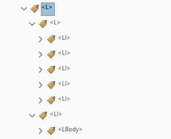
Lists give me a lot of pain, mostly because I still have so many questions about them. I continuously identify issues with lists only after I’ve converted the Microsoft Word document into a PDF and am already half-way through the process of tagging the PDF. When I encounter problems with lists in the PDF, an accessibility expert cautioned me, this may mean the list is problematic in its original form in Word. In the PDF, a sign of a problematic list reveals itself in the Tag pane; sometimes I’ll see <L> tags nested under other <L> tags when I think they shouldn’t be. My impression is that, in most cases, an <L> (list) tag should open up to <LI> (list item) tags, not more <L> tags.
When I investigate the list in Word, however, I remain rather clueless. I make sure to use the built-in list structures in Microsoft Word, but problems keep popping up in the PDF. Sometimes I notice that in Microsoft Word, when I click on the list marker (like a bullet point or a number), not all of the list markers highlight as pictured below:
Of the four list item markers pictured in the screenshot above, only three are highlighted (2, 3, and 4), while the first item marker, “1),” remains unhighlighted. I’m still not sure why and how this is happening, but I take this as evidence that the list may not be in perfect shape. When I encounter lists like this, I try to remove and re-apply the list markers (using the built-in ordered and unordered list functions in Word) so that they are all connected and highlighted when I click on the list item markers.
Is this addressing the issue? Or is it a waste of my time, and yours? I’m still not sure. It’s on my long list of questions I hope to one day ask an expert. Their time is precious, and I tend to prioritize problems I perceive as more urgent when I am able to meet with an expert. If you are reading this and thinking, “I know about lists!,” I welcome your comments below!
Ultimately, if I find a problematic list once I’m already working on the PDF (which means I’m “done” with the Word), I need to decide if it’s worth it – based on the context and importance of the list, as well as my capacity – to return to the Word version and repair or recreate the list. On my first accessibility project, I felt exasperated toggling between the Word and the PDF in a trial-and-error attempt to repair problematic lists in the PDF. In the end, I included a note about remaining problems with select lists in the PDF in our Accessibility Statement [See “Lists and Tagging in the PDF”].
Multimedia
I haven’t worked very much with multimedia in my accessibility work so far. Per BCcampus’ Checklist for Accessibility, we try to make sure all video or audio associated with our OER include accessible transcripts and captions. At Portland State, our Office of Information Technology offers captioning services for PSU content creators.
Font Size and Formatting
We try to make sure all body text is at least size 12 font, and no lower than 9 point font for footnotes, endnotes, and captions. When we encounter scenarios in which font color, highlight, or bold/italic/underline has been used to convey meaning, we create and apply the “Emphasis” style in Microsoft Word and note this fact in our accessibility statement at the beginning of the book. I still have a lot of questions about the Styles pane in Microsoft Word – and how helpful our approach even is – but this is what we’re doing right now based on our knowledge and feedback from the community. Reliable sources advise me against using italics except for examples of words in second languages or reference lists in APA or MLA. Again, I welcome others’ wisdom in the comments!
Second language issues, formulas, and reading direction
These are all subjects I’m flagging as issue-prone, but I do not have much experience addressing them (yet). In preparing a manuscript for Scribe, our team did collaborate with a faculty author to create alternative text for math equations. We used a free-to-use online tool from WIRIS which made the process smoother. Moving forward, I would refer back to the BCcampus Accessibility Toolkit chapter on accessible formulas.
“Last” steps in Word
As I make my way through the book, I undoubtedly discover additional, unforeseen accessibility issues. The more I get to know the book, the better I understand its problems. Oftentimes these problems are complex and interconnected, and require circling back, as well as some sort of trade-off or strategic prioritization. Whether or not we can successfully address every last issue in the book, we do our best to track accessibility issues and document remaining problems in the “Known Issues/Potential Barriers to Accessibility” portion of our accessibility statement.
A good “last” step with the Word document is to run to the Accessibility Checker (File>Info>Check for Issues>Check Accessibility ; if you have an older version of Word, this might not be possible). While Word’s accessibility check tool is no substitute for manual evaluation, repairs, and re-creation of inaccessible content, it is a helpful tool for catching any last bits—especially missing alt text and header rows, or the presence of excessive spaces.
I refer to the accessibility check as a “last” step with “last” in quotation marks because, as mentioned previously, I often encounter additional issues once I’ve moved on to the PDF. It is not unusual for me to return to the Word document after I’ve thought I finished weeks ago, only to remediate lingering problems. Remember when I called this process “iterative”?
PDF Accessibility
After “completing” accessibility improvements to the Microsoft Word version of the book, I export the document to a PDF. Adobe Acrobat PRO is necessary for making the PDF as accessible as possible. I won’t get into the details here, but the three major steps that I take, following the guidance of the accessibility experts I’ve consulted, are as follows:
- Ensure the PDF’s title reflects the book title, not the file name, and that the PDF’s page numbers correspond with the actual page numbers appearing in the content of the page. Set the language, too!
- Touch up and confirm correct reading order
- Ensure the document has proper tags (this is where I struggle the most and have found errors with lists and tables, which often requires me to go back and make additional fixes to the Word doc, then re-export it as PDF, start over, take a breath, try again…)
Because we put so much time and effort into improving the Word version, improving the accessibility of our PDFs has been much less painful than I’d first feared. Nearly all of the accessibility features we built into Word carry over to the PDF – the heading structure, the alt text, the properly structured tables, and more. Of course, if all you have is an inaccessible PDF with no access to a source version in Word or html, you will likely have a more difficult time. In that case, I would probably end up acknowledging my limited capacity and include more disclaimers in the “Known Issues/Potential Barriers to Accessibility” section of our accessibility statement.
Importing into Pressbooks
After improving the accessibility of the PDF, I import the Microsoft Word version of the book into Pressbooks. On my first attempt, I created the Pressbook before repairing the PDF. This was problematic and less efficient, because when I was working with the PDF I found issues with the original Word version. Now we wait to import the Pressbook until we know the Word version is in its “final” form—which we can only know once we have finished working on the PDF.
While I have made sure that the Pressbook has accessible headings, subheadings, images, links, and font size, aiming for maximum accessibility of the Pressbook has not been a top priority for us. This is purely contextual to our program; we do not refer faculty and students to Pressbook versions of our PDXOpen textbooks as the main version for teaching and learning.
Instead, the impetus behind our PDXOpen Pressbook instances is to provide copies of our open books made easily for adapting and adopting. Throughout this process, whenever I speak with an accessibility expert, I’m encouraged to think carefully about what versions of books we are sharing and why. In our case, the accessibility of the Pressbook takes less priority than the Word and PDF versions.
Sharing out / user testing
We haven’t explored this step as much as we would like to (yet!), but I’ve been encouraged to consult with a community of users and accessibility experts to test the improvements we’ve made. This doesn’t mean we need to shell out on expensive software; there are a number of free tools out there that can help you test – whether that means downloading the free NVDA screen reader, Immersive reader in Office 365/Word, Voiceover in OSX, color contrast tools found on the open web, the tota11y tool, and more.
Conclusions
If it’s not abundantly clear, improving the digital accessibility of open textbooks can be a challenging and lengthy process that should not be taken lightly, especially if you – like me – are teaching yourself accessibility principles and accessible/universal design as you go. That said, there are simple steps that all of us can take to improve digital accessibility of OER. Until we have more training, staffing, and funding, we creators and publishers of OER must do the best we can to improve the digital accessibility of our open textbooks with whatever resources we have.
We must work together, research, seek counsel from experts and the wider community, and, at the very least, model transparent communication when we are unable to address a barrier to accessibility. While the prospect of improving the accessibility of an open textbook might sound agonizing, this work is critical if we want our open textbooks to be perceivable, navigable, and understandable for as many educators and learners as possible.

Thank you for this well written reflection. I’m training on OER and UDL but I can’t see any way to honor the accessibility mandate without adequate manpower and you have further validated my immense frustration!
Hi Elaine, I hope that having Katy’s post to point to can help you make the case! Amy